Why Did Google change Its Logo? Here’s the explanation
Google unveils a refreshed logo that captures its evolution, blending simplicity and modernity to reflect the future of digital innovation.

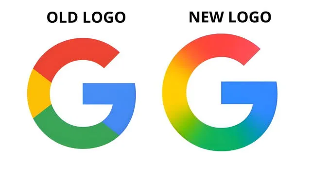
Google unveiled a refreshed version of its iconic "G" logo on May 12, 2025—the first significant update in nearly a decade. The new design features a subtle gradient that blends the brand’s signature colors: red, yellow, green, and blue. It introduces a more vibrant, modern appearance aligned with current design trends. The update is currently visible on Google apps for iOS and Pixel devices. Other platforms still display the older version of the logo for now.
This design change reflects more than just a visual upgrade—it marks a strategic evolution of Google's brand identity. The gradient effect mirrors the aesthetic used in Google's Gemini logo, suggesting a unified visual direction. The updated logo aims to embody dynamism, adaptability, and modern digital aesthetics. Though subtle, the update signals innovation while maintaining the company’s familiar brand elements. The move reinforces Google's forward-looking design approach.
Google's new logo sparks online buzz as tech giant tests sleek redesign amid competitive market shift
The logo rollout is gradual, possibly allowing Google to gauge public feedback before a full-scale launch. The company hasn't made an official announcement, but the change has been spotted by users and tech outlets. Early reactions have sparked discussion across social media and design forums. Some users praise the sleek, polished look, while others prefer the simplicity of the previous design. The staggered update hints at a careful, user-focused release strategy.
This redesign also serves as a brand revitalization tactic in an increasingly competitive tech market. It reflects Google's effort to remain visually relevant and appealing to newer generations of users. The fresh look complements Google’s focus on innovation across its services and platforms. A modern logo can influence perception and reinforce trust in a brand’s evolution. It signals continuity with a forward-thinking vision.
Google’s gradient logo redesign enhances digital versatility and reflects a modern brand identity
Functionally, the gradient logo may offer improved scalability across digital environments and screen resolutions. Its smooth color transitions can enhance readability and recognizability across different devices. The gradient also reflects modern UI/UX design preferences for dimensional, layered visuals. It helps Google maintain a leading edge in terms of visual consistency and user engagement. The design is both aesthetically pleasing and technically versatile.

From nostalgia to modernity: Google’s logo transformation reflects its shift toward a more dynamic and unified brand experience across platforms. Photo: Google
In summary, Google's updated "G" logo is a thoughtful refresh that aligns with both branding strategy and design innovation. While it maintains the essence of the original, the new gradient adds sophistication and relevance. As Google continues to expand and evolve, the refreshed logo supports a broader narrative of progress and coherence. It’s a subtle yet strategic move to reaffirm the brand’s modern identity. The change exemplifies how design can reflect a company’s evolving mission and culture.


